Design Description
Design Concept Analysis: Italian Floral Summer - Autumn Women’s Wear
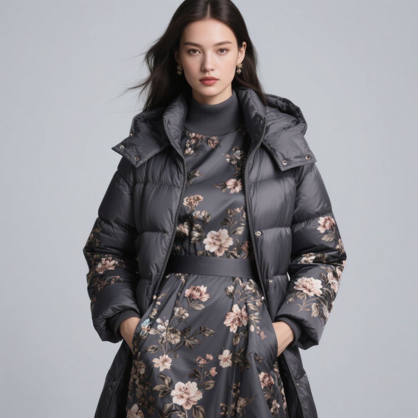
1. Aesthetic & Thematic Direction
The design embraces a romantic Italian floral aesthetic, merging classic European botanical motifs with modern sophistication. The “Italian floral” theme evokes timeless elegance, drawing from Mediterranean - inspired artistry. Think of delicate or bold blooms that suggest a connection to nature, leisure, and refined femininity. This thematic choice balances nostalgia (vintage floral trends) with contemporary fashion, appealing to those who seek both romance and modernity in their wardrobe.
2. Pattern: Floral Narratives
The “Italian floral” pattern likely features botanical prints (either intricate, delicate blooms or statement - making large flowers) as the focal point. Floral motifs are a perennial trend in women’s fashion, and the “Italian” framing adds cultural depth, implying a curated, artisanal touch. This pattern injects playfulness and softness, contrasting with the deep gray base to avoid overly “sweet” styling and leaning into mature sophistication.
3. Color Palette: Deep Gray & Floral Contrast
The deep gray base acts as a refined, neutral canvas, elevating the impact of the floral pattern. Gray’s versatility (it’s like a “chameleon” color) ensures the piece pairs easily with neutrals (such as black, white, and tan) or complementary hues (like blush, emerald, and mustard). At the same time, the floral prints introduce pops of color (likely vibrant or muted tones, depending on the bloom’s design). This color strategy—dark gray plus vivid or floral accents—strikes a balance between understated elegance (from the gray) and eye - catching femininity (from the florals), avoiding monotony while remaining appropriate for both office and event settings.
4. Seasonal & Functional Versatility
Positioned as “summer - autumn” wear, the design prioritizes transitional adaptability. In summer, it can function as a lightweight statement piece, ideal for breezy days or when layered under sheer outerwear. In autumn, it allows for layering, such as over turtlenecks, under blazers, or paired with cardigans. This season - less approach aligns with modern “capsule wardrobe” principles, reducing waste and offering long - term value. The fabric (implied by “polyester” and “gorgeous” textural cues) likely balances breathability (for summer) with enough structure (for autumn layering), ensuring comfort across temperature shifts.
5. Material & Textural Storytelling
The use of “gorgeous polyester” (implied by ) suggests a fabric with luxurious visual appeal. It could be a smooth, slightly sheened finish or a textured weave that enhances the depth of the floral pattern. Polyester’s durability, wrinkle - resistance, and color - retention properties make it practical for everyday wear. Meanwhile, the “gorgeous” descriptor hints at elevated design details (such as print clarity, fabric drape, or subtle sheen) that take it beyond basic casualwear. This material choice combines practicality (easy care and longevity) with aesthetic ambition (a “gorgeous” look), catering to style - conscious yet busy consumers.
6. Silhouette & Detail Execution
Although the specific silhouette (like a dress, blouse, or skirt) is implied, the integration of the floral pattern suggests a feminine, figure - flattering cut. For example, a fitted bodice with a flowy skirt (for a dress) or a relaxed blouse with tailored lines (for tops) would balance the “gorgeous” floral drama with wearability. The scale of the floral print (delicate or bold) likely dictates the formality of the silhouette—smaller blooms could be office - appropriate, while larger, bolder prints suggest evening or weekend versatility. This attention to silhouette ensures the design feels both feminine (through floral romance) and empowering (through a flattering fit), avoiding overly “costumey” floral styling.
7. Conceptual Goals & Impact
The design aims to reimagine “floral wear” as a year - round, modern classic, no longer confined to spring. By targeting summer and autumn, it fills a gap for transitional, weather - appropriate femininity. The “Italian” floral framing adds cultural allure, positioning the piece as a curated, stylish choice rather than a generic trend. Ultimately, it balances elegance (from the deep gray and tailored lines) and romance (from the floral prints), appealing to women who want to feel refined, playful, and seasonally appropriate.
Rating: 8/10
The design excels in versatility (summer - autumn adaptability), thematic cohesion (the combination of Italian floral and deep gray sophistication), and practical luxury (polyester’s durability plus “gorgeous” aesthetics). Although the “insulation” (from the filename) is ambiguous (possibly a translation quirk), the core concept—marrying classic floral romance with modern, season - spanning sophistication—feels well - executed. Minor improvements could include bolder silhouette experimentation or clearer “insulation” (if functional) integration. But overall, it delivers a polished, marketable vision of feminine, versatile fashion.